


Your sign is usually the first thing potential customers see when they’re looking at your business. If the message isn’t clear and visible, you risk losing attention before customers even enter through the door. This guide will help you avoid common design mistakes that can make your signage less visible.
1. Poor Font Choice and Readability
Decorative or complex fonts are difficult to read on signage. When people can’t quickly understand your message, they’re probably going to go elsewhere. Such a design compromises the impact of your signage.
Choose fonts that are simple and bold for effortless reading from afar. They distinguish your message in various environments. This contributes to more effective signage.
2. Weak Colour Contrast
Low contrast between the text and its background makes signage that much harder to see. Colours that fade with one another decrease visibility, especially at greater distances. Such issues may lead to your message getting lost.
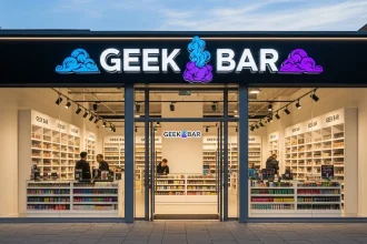
High-contrast colour combinations make your signs easier to read. Enabling it makes your text pop in different lighting conditions. This improves overall impact.
3. Overcrowded Design
Making an effort to include too much information may cause the signboards or banners to appear messy. When there is too much to read, people can shut it out entirely. Such confusion is exactly what signage is meant to prevent.
Commercial Signage in Australia can help you design clean and focused designs. The fewer messages there are, the more they can be processed and retained. This improves visibility and engagement.


4. Incorrect Sign Placement
If your signage is placed in the incorrect location, it will not be effective, regardless of how well designed it is. In addition, signs that are either too high up, too low down, or obscured by other objects are more likely to be ignored. Be mindful of the fact that placement is a significant component of visibility.
One way to improve visibility is to position signs so that they are either at eye level or in the line of sight. By doing so, you ensure that people will have an easy time seeing your message.
5. Ignoring Lighting Conditions
The brightness of the lighting can have a significant impact on how people interpret your signage. Even well-written signs can become unreadable if the lighting is poor. This is very important at night or when it’s dark.
Your sign must be illuminated so that it is always visible. Both the legibility and the attention are enhanced as a result. On top of that, it makes your sign more trustworthy.
6. Inconsistent Branding
The potential customers may become perplexed if the signage you use does not correspond with your brand. Colours, fonts, or messaging that are not in sync with one another dilute recognition, which in turn reduces the overall impact.
Having a consistent design that represents your brand will strengthen your identity. It helps businesses become more well-known and be remembered by their customers.
7. Using Low-Quality Materials
Materials of lower quality are more likely to deteriorate, crack, or fade over time. Because of this, the appearance and functionality of your signage will change over time. It can also leave a negative impression.
Using durable materials means that your signage will be legible and attractive. Long-term effectiveness is supported by the fact that its visibility does not change depending on the weather.
Make Your Signage Stand Out and Stay Seen
The people who walk by your store every day know more than anyone else what a sign can do for you. If you don’t make these common design mistakes, your signs will be easier to read, clearer, and better at getting your message across. In this way, you can quickly grab people’s attention and confidently lead them to your business.